Lotus Yoga Studio
Location: Point Lonsdale, Australia
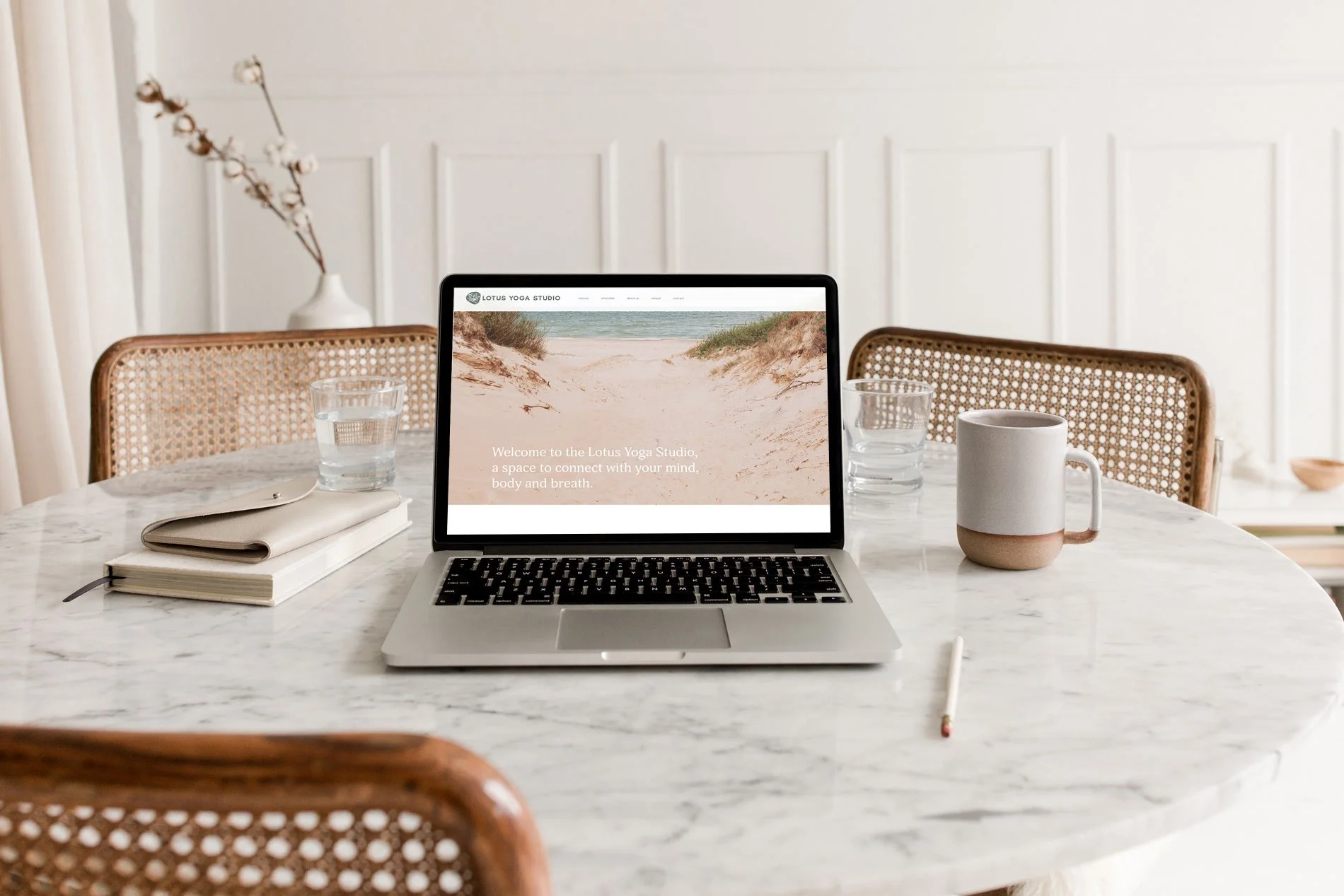
Scope: Strategic Branding + Website Design + Icon illustration
Lotus Yoga Studio offers the Bellarine Peninsula community classes of yoga and meditation.
They want to make sure that yoga is accessible for everyone and educate people that it is much more than just poses, with a belief that it is what happens off the mat that is important.

“I was referred to Monique by two friends who spoke very highly of her work, dedication and commitment. Needless to say, I was not disappointed! Monique gave me lots of workbooks to fill in answers to her questions and although I found these probing, they certainly challenged my way of thinking. There was definitely method to this task, as Monique wanted more than just to create something, she wanted to create something and make it look like I had done it!! She really got inside my head and came up with a logo on a first attempt, that was exactly how I imagined it. I would have no hesitation recommending Monique; WORK WITH HER, allow her to delve into your mind and the results will not disappoint.”
— Dianne Riley, Lotus Yoga Studio
Dianne came to me wanting a Lotus logo (maybe in watercolour) to talk to the story of the magical flower rooted in mud.
After diving deep into her brand purpose, audience and values we discovered that it needed to be “imperfect” in design.
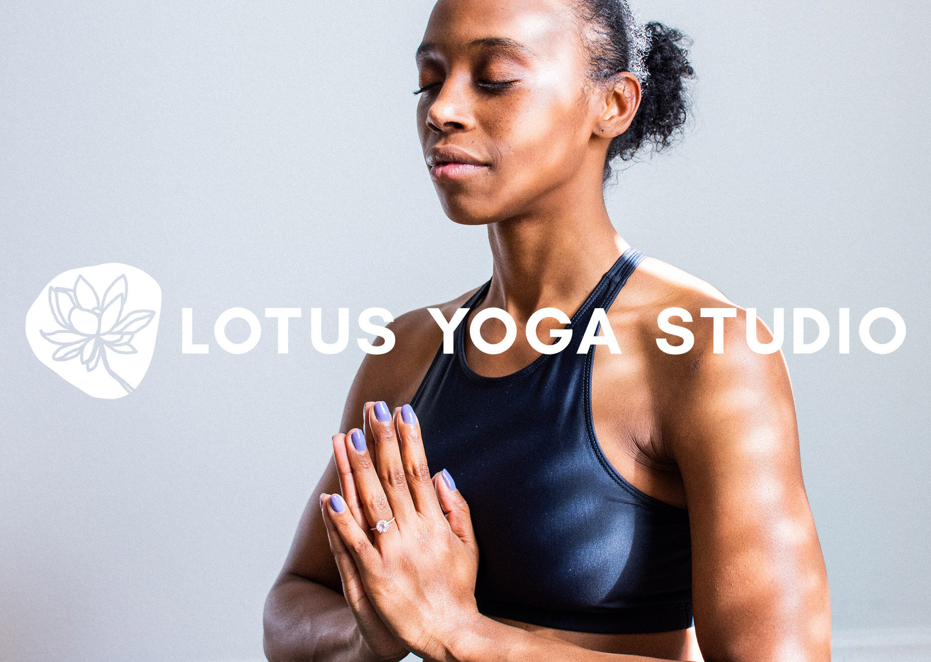
I used a hand drawn, irregular circular shape to ground the lotus illustration. This represented community which was so important to the brand. The detailed line illustration of the lotus was also hand drawn with wiggly imperfections.
To balance the logo, a bold, clear and simple font was used. This aligned with the values of simple, serenity, strong and calm - it also made it more inclusive for all to be able to read easily near or far.


